
Zine Poster
Based on pseudo-identities, i interviewed someone who uses twitter to create a different personality and used the results to base my poster:

fashion film

behind the mask development work
here i have continued with the idea of using a balaclava to hide the identity and have implemented a coloured bar that coveres the eyes, this is because we use eye contact to try to understand someone more as well as recognizing those we know. The different colours would represent the different alter egos which create this one person.


FANZINE
this book is filled with old, popular fanzines and also documents the history and evolution of them, i picked it up from waterstones and it is proving to be very useful with research as well as style ideas.


character profile
this technique used by police to piece together to identity of criminals from witness testimonies can be very useful when conveying my ideas with voyeurism and alter-egos. i feel that this experiment i have done has been very successful on giving the connotation of creating a person out of many which can be related to the many personalities of someone or the many observations of a stranger.


too many ideas, not enough time
as usual i'm finding it hard keeping to one idea and therefore i will display another strong idea for my zine, it is kind of linked to my previous idea so i guess that is a good thing.
voyeurism -
everyone is compelled to notice each other, and with your attention drawn you then feel the need to watch this person and what they are doing, this then leads to you making assumptions about this person through the limited time you have watched them, creating a character profile and almost obsessing over trying to figure out everything about them even though you know it is a ridiculous thing to do.
what i want to find out is why do people do this?
is there an underlying sexual context to it or is it purely an investigative compulsion?
is it common among all cultures or is it just a western fixation?
DUSTUP poster
a design i done for the dustup after party, i thought i'd incorporate the chromo research i done for the card designs while including a hint towards the FEED poster design (split triangles) for a subconscious connection if not a conscious one.


FEED poster
visuals were inspired by Beautiful TV's show reel, i thought it was appropriate to include such visuals as alink to the agency as well as a feeling of continuity.


behind the mask
some development work focusing on a physical mask.
this was more of an experiment with the photocopier and a created background using various available materials.
this can prove to be useful in future work if i could perhaps reference relevant materials as the background with a dominating overall image giving the message away clearly, creating multiple layers to the production.

Behind the mask
hiding your true identity is something quite common in society, the most prevalent and obvious example is those who are trying to project an image of themselves which they have created through the internet either via a social networking profile; a series of videos on a video sharing website; online gaming or a blog.
the underlying question is, why?
What is wrong with who we are that we decide to create a new version either through personality, physical appearance or a total overhaul of you as a person.
this is something i am quite interested in as i find myself to be quite interested in getting know those around me either through conversation or just noticing personal habits, the challenge is now where do i take it.
christmas cards
here are my christmas card design results:
this design was based on Rothko's work with colour harmony, i feel using colours related to christmas - so deep and calming tones - i am using Season's Greetings as it is non-religious and therefore opens it to a wider audience.

this is based on Protein's chromo calendar using the colours corelating this season.

with this design i was focusing on the typography while taking more inspiratation from Rothko's work with colour on colour, i decided to keep the type in it's rawest form to create a more humane touch.

colour meanings
this website could prove to be helpful when it comes to trying to use colour to convey the ideologies of christmas.
http://www.color-wheel-pro.com/color-meaning.html
http://www.color-wheel-pro.com/color-meaning.html
Rothko
Rothko's use of blocks of colour could be a very interesting way of showing people, which is something i would like to explore. As this time of year can be about families and friends coming together


Protein Calendar
Protein's Chromo Lunar Calendar is very interesting when thinking about colour for a not-so-obvious christmas card.


a car crash of letters
inspired by Yoshinobu Ku's work on the maori type i have created another poster to accompany the other two for exhibiting the typeface.
keeping to the theme of working around the quote this poster illustrates the loss of time and therefore all events occuring at once, in this case viewing each individual letter is now occuring at once and therefore they are now illegible, this adds to the thought provoking intent with my designs and will hopefully make the audience realize just how overwhelming it would be to experience everything at once.

keeping to the theme of working around the quote this poster illustrates the loss of time and therefore all events occuring at once, in this case viewing each individual letter is now occuring at once and therefore they are now illegible, this adds to the thought provoking intent with my designs and will hopefully make the audience realize just how overwhelming it would be to experience everything at once.

Continuum 2.0
this is the improved version of my poster, i have changed the replications of letters in order to stop the design from looking stale.
i have also went back to my gray scale colour palette as i feel it is the most effective of portraying my message.

i have also went back to my gray scale colour palette as i feel it is the most effective of portraying my message.

Continuums
i made a change to the poster by adding variants in colours in order to see what colour will help me convey my message along with the type.
unfortunately i feel that colour has no effect in fact if anything it starts becoming to aesthetic and so detracts from the message.

unfortunately i feel that colour has no effect in fact if anything it starts becoming to aesthetic and so detracts from the message.

Continuum
my font Continuum in action, the idea behind the poster design is to give a feeling of so many events happening at once you don't have the time to catch a glimpse before they are gone.


Continuum alphabet
this is my font finalized, the variation in stroke sizes give an impression of different sized parts which create the whole letter like a clock.


Yoshinobu Ku
i really like the display of this typeface, specifically the poster showing multiple characters overlapping, it creates a chaotic feel as they become illegible.
if i use this with my font i feel that i can create an interesting design that adheres to my inspiration and message.

if i use this with my font i feel that i can create an interesting design that adheres to my inspiration and message.

font
inspired by the measurement of time through the intricate workings of clocks and the quote "Time is what keeps everything from happening at once" - Ray Cummings


Si Scott Studio
this typography is beautiful to look at and gives a feeling of ink flowing and creating these shapes.
on the other hand the flairs and lines also create a feminine theme with this piece of work for tokyo design week which could then alienate some of the audience.
compositionally it works being centrally aligned as there is a lot of detail surrounding the piece and so it needs to drawn the attention to the center and therefore the words in order for the audience to be able to identify what it is that they are supposed to be seeing.

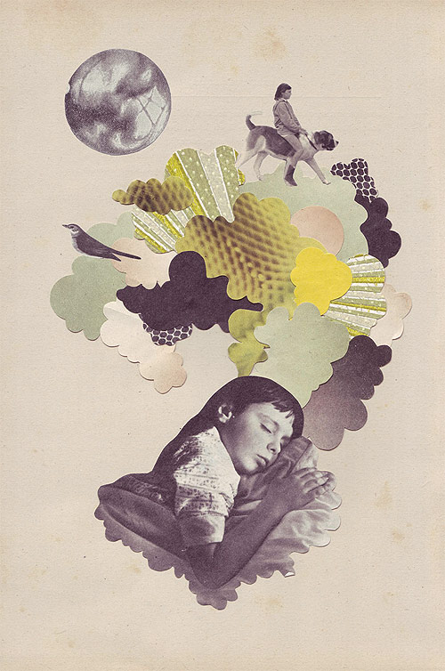
Eleanor Wood
dreams are often said to be a way for the brain to sort out events which have occured during the day, and so these collages made by Eleanor Wood can corellate to the theme of 24 hours.
the dreams can illustrate the passage of time and also the technique being used combined with the muted colours are a fresh sight when compared against the current trend of sleek and over-colourful designs.

the dreams can illustrate the passage of time and also the technique being used combined with the muted colours are a fresh sight when compared against the current trend of sleek and over-colourful designs.
mcbess showreel
The style that McBess uses has a nostalgic feel to it with a similar look of the first Disney animations.
Ootje Oxenaar
from 1966 to 1985 he created Dutch banknotes.
this is the most beautiful money i've ever seen, the colours are striking and not what you would expect to be commissioned from the government, this gives an idea of the country being culturally adept and more contemporary than other countries.
the composition shows a sophistication rarely seen even in today's designs which is shocking considering how much graphic design is supposed to have evolved.
the abstract shapes and imagery only add and emphasize my point of promoting a contemporary nation which is not only going to make those who live there proud but also impress those who visit the country and hopefully start a trend for all countries.

Retna
so while i was looking through some magazines to see what would help me in my given summer brief i came across Retna with his beautiful mark making and calligraphic style.
the use of angular lines and circles creates a striking minimalistic style that adds to the impact when combined with the colour choice, the lack of legibility and it being not written in any language gives the audience a feeling of hopelessness as they try to decipher a hidden message which is not there.

the use of angular lines and circles creates a striking minimalistic style that adds to the impact when combined with the colour choice, the lack of legibility and it being not written in any language gives the audience a feeling of hopelessness as they try to decipher a hidden message which is not there.

Luca Barcellona
i always look at this guy for inspiration when it comes to typography, the sheer amount of styles he has stored in that brain is enough for him to be considered a serious contender in the design world let alone the execution of these styles.
the flow is phenomenal and it really adds life to his work which is a breath of fresh air when compared to computer design typography which follow a more mathematical approach usually.
the use/abuse of letter structure is what i wish to learn from this time round when looking into his work.

the flow is phenomenal and it really adds life to his work which is a breath of fresh air when compared to computer design typography which follow a more mathematical approach usually.
the use/abuse of letter structure is what i wish to learn from this time round when looking into his work.

Linder Sterling
another great use of manual collage techniques, Linder Sterling.
subverting the original material to create a new narrative and message is something graphic designers strive to achieve all the time.

subverting the original material to create a new narrative and message is something graphic designers strive to achieve all the time.
Bauhaus
if i am going to be inspired by the angles and shapes of clock work and then simplify them in order to create a font i should defiantly have a look at Bauhaus and it's pioneering designs.
the composition and shapes are similar to what i will be looking at creating and it's composition was highly unorthodox at the time.

the composition and shapes are similar to what i will be looking at creating and it's composition was highly unorthodox at the time.

Jamie Reid
the amazing use of manual techniques and ephemeral style communicates the ideologies of national art hate week, art is considered a flawless and beautiful representation of what an artist sees, feels or imagines.
this piece shows the feelings towards the art world, conveying violence with the smashed glass

this piece shows the feelings towards the art world, conveying violence with the smashed glass

Clocks
i am currently looking into time and its mesurements, one way of measuring time is with watches and clocks and so i'm looking into the anatomy of said items.
the answer to my brief could be hiden in these intricate cogs...

the answer to my brief could be hiden in these intricate cogs...

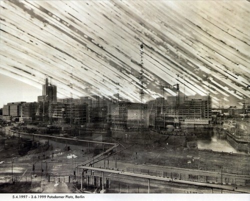
Michael Wesley
this technique of photography takes the capturing of time in photography from Muybridge and placing it into one photo, this technique was achieved with pin hole cameras and what brought him to this technique was the need to capture thousands of moments in one photo.

Eadweard Muybridge
this is an example of time captured within photograpy, although they are multiple stills when put together you can see the time line and flow of events.
if applied to my brief i could set up a camera in a room and take periodic photos showing the rooms use throughout 24 hours.

if applied to my brief i could set up a camera in a room and take periodic photos showing the rooms use throughout 24 hours.

Persistence of memory
while looking into the concept of time I also looked at time featured in art, such as Salvador Dali's devaluation of time in his piece Persistence of Memory


what is time?
according to the dictionary time is defined as "the system of those sequential relations that any event has to any other, as past, present, or future; indefinite and continuous duration regarded as that in which events succeed one-another."
Sir Issac Newton believed in the idea that time is a fundamental part of the structure of the universe, as a dimension that events occur within in sequence.
on the other side there is a belief that time is not something in which events occur and is not measureable but is instead combined with space and numbers for humans to compare events.
these concepts are a good base in which to find a narrative or inspiration.
Peter Saville
when gaining inspiration you can't not look at the work of Peter Saville.
this work is using the information captured from an exploding star and representing it in a 3D graph, this passage of time is therefore illustrates within these lines which make up a very technical looking image.
the composition and use of colour illustrates this bright explosion occurring in an empty vacuum of space, this imagery being conveyed to the audience can provoke a powerful response and so it just strengthens the argument of Peter Saville being the godfather of graphic design, the thought that goes into the design choices are sometimes neglected in today's design community which can lead to potentially great pieces being let down.


summer brief
what would be a better first post than outlining my summer brief:
"Explore the theme of 24 hours.
Life as we know it can change in a millisecond. A bomb, a kiss, a thought can all change in a single moment everything we know. 24 hours is a very long time or is it? 24 hours to go with a deadline approaching seems alot shorter than 24 hours sleeping on the floor at an airport due to a delay."
Subscribe to:
Posts (Atom)